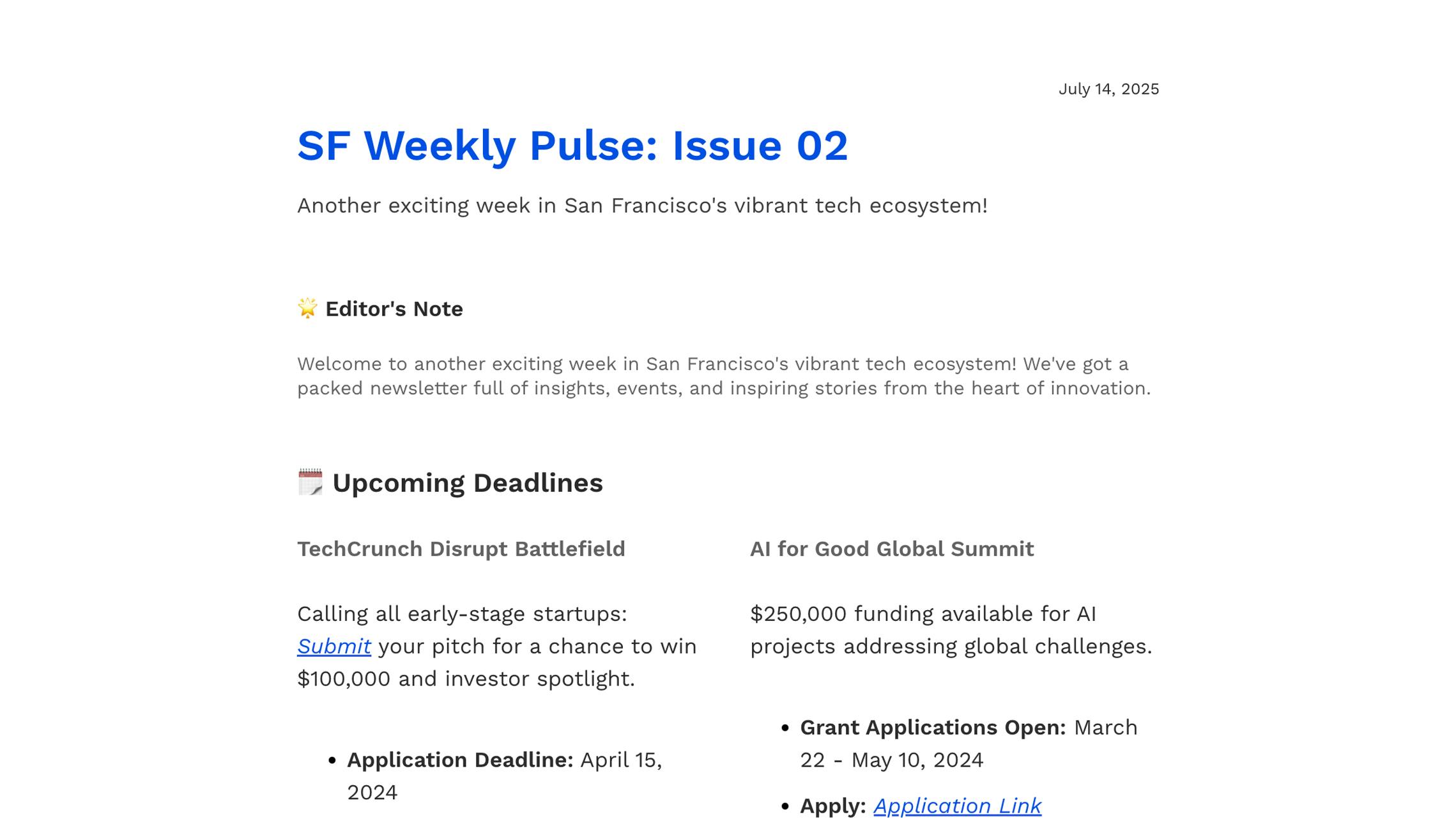
Overview
The Tech Roundup template is designed for publishing structured tech newsletters in beehiiv. It helps you organize news, updates, and insights into a clear, engaging format.
Type | Tech news and roundup newsletter template |
Platform | beehiiv |
Best for | Tech news, weekly updates, curated content |
Key benefit | Structured, easy-to-read content format |
Key Features
- Pre-built layout for tech news and updates
- Structured sections for headlines, insights, and events
- Supports long-form content with clear hierarchy
- Easy customization in beehiiv editor
- Mobile-friendly and readable across devices
How to Use This Template
- Open the template in your beehiiv dashboard
- Customize the content with your news, updates, or insights
- Adjust sections based on your format (weekly, daily, or digest)
- Add links, images, or CTAs where needed
- Send or schedule your newsletter
This template can be edited directly in the beehiiv post builder and reused for recurring issues.
Why and When to Use This Template
This template is best suited for content-driven newsletters that require clear structure and consistency.
Use this template when:
- you publish weekly or daily tech updates
- you curate industry news or trends
- you share multiple stories in one email
- you want a consistent newsletter format
Why it works:
- organizes complex information into sections
- improves readability for long newsletters
- keeps content consistent across issues
- helps maintain a repeatable publishing workflow
Frequently Asked Questions
Do I need technical skills to use this template?
No. The template is designed to be used inside beehiiv’s editor, where you can edit content, layout, and sections without coding.
Can I customize this email template?
Yes. You can modify text, sections, structure, and styling to match your brand and content format directly in beehiiv.
Is this template optimized for mobile devices?
Yes. beehiiv templates are designed to be responsive, ensuring your newsletter is readable across mobile and desktop devices.