- Home
- Posts
- Email Design Trends 2026: 11 Modern Newsletter Ideas
Email Design Trends 2026: 11 Modern Newsletter Ideas
Engage Your Subscribers This Year With These Best Practices
Megan Smith
June 5th, 2023

Email isn’t just “big” anymore— it’s dominant.
In 2026, inbox competition is more intense than ever. AI-generated content has exploded. More creators are launching newsletters. And attention spans are shorter than ever.
The good news? Design is now a growth lever.
The newsletters growing fastest in 2026 are visually intentional, mobile-native, interactive, and personalized.
If your emails still look like 2021 templates, you’re blending in.
Here’s what’s actually working now.
Email Design Trends 2026: What’s Driving Engagement Now
What are the design trends for 2026? If you want to better appeal to your audience, try out one of these trends in reader engagement.
Dark Mode Optimization
Take care of your readers. Dark mode can reduce eye strain and improve readability, especially for those reading emails on mobile devices. Neurodivergent folks also benefit, making your designs more accessible.
Dark mode has become a popular feature in many applications, including email clients.
To optimize your designs for this setting, use bright, high-contrast colors and other dark-mode-friendly elements. You might also test out your emails by reading them in both dark mode and light mode, making sure the communication remains clear.
Inconsistent logo rendering and background inversions are among the top overlooked design errors in 2026. Test dark mode in Gmail, Apple Mail, and Outlook before sending.
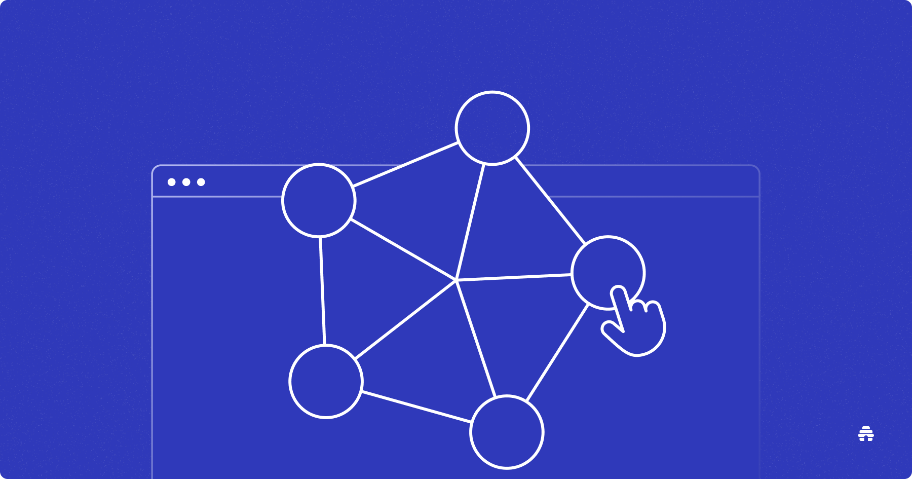
Interactive Emails
Interactive emails are another trend that will dominate email marketing in 2026. Interactive elements, such as quizzes and games, make emails more engaging for subscribers. With each click, readers can also provide marketers with valuable data.
Interactive elements consistently outperform static emails in click-through rate and dwell time, especially when paired with segmentation and personalization.
Why not add a poll or a survey to your next beehiiv newsletter? Learn precisely what your readers want from you in the future and make their immediate experience more fun.
You could also experiment with hover boxes or other click-activated graphics. Humans like pushing buttons and seeing the effect. Micro-interactions create momentum. Momentum increases engagement.

Draw inspiration from the interactive images in this recent email from Disney. The Magic Kingdom stays on top of the latest email design trends.
Hyper-Personalization
When you see your friend across a crowded room, how do you get their attention? You call their name.
In 2026, personalization is not demographic. High-performing newsletters dynamically adjust:
Content blocks
Product recommendations
Sponsor placements
CTA copy
Send time
Static broadcasts are losing ground to adaptive messaging.
Both marketers and creators should segment their audiences. Segmentation allows readers to opt-in to the content they want and assists businesses to create targeted, relevant, and (most importantly) effective campaigns.
Web-Design Aesthetics
In addition to more interactivity, we can expect to see other principles of web design adapted to the world of email. Keep an eye out for more visual elements that add depth, movement, and interest to the layout.
Email design now borrows directly from modern web UX:
Layered depth
Modular blocks
Soft shadows
Scroll-friendly spacing
Intentional motion cues
Animation
If the illusion of movement isn’t enough, animate those visuals. Add GIFs or videos to make emails more dynamic or demonstrate cool features of your product.

Adobe goes meta with its email marketing design trends. It promotes an animation tool with an animated email.
In addition to broad changes that affect the reader’s interaction with the message, email design trends 2023 include the hottest visual fashions. Bold and original designs win the day, so try one of these on for size.
Vibrant Colors
Bold and bright colors can grab attention and create a sense of excitement or urgency. However, it's important not to overdo it — too many colors can be overwhelming and distracting. Think “eye-catching” and not “stroke-inducing.”

Not all vibrant colors are neon. Skincare line Djusie catches the eye with vivid reds and greens.
Original Graphics
Readers are over unimaginative stock photos. Original imagery, such as custom photography, makes newsletters feel more authentic and unique.
Or take it a step further with your own illustrations. You can convey information visually or simply add a dash of personality.
Big and Bold Typography
Expect to see more big and bold typography in your inbox. Large fonts can make headlines or important information stand out while adding visual interest to the design.
As with some of the other latest email design trends, bold fonts are best used with restraint and intention. Use them for calls to action and headlines.

Check out this announcement for a web series from Filmsupply. The title instantly grabs the reader.
Minimal Templates
On the other hand, you could go in a different direction entirely with a more minimal design. Minimal templates feature clean lines, plenty of white space, and simple typography. They help draw attention to the most critical elements of your email and make it easier for users to navigate it.
As an added bonus, minimalism is timeless and never truly out of style. (No need to worry that you’ll be embarrassed by a metaphorical bad haircut down the road.)
AI-Assisted Design Optimization
Modern platforms now use AI to:
Suggest subject line improvements
Optimize layout spacing
Recommend CTA placement
Predict click performance
Instead of manually A/B testing everything, creators now use AI to accelerate optimization.
Design is data-informed.
Mobile-First Layout (Not Just Responsive)
Responsive is outdated. In 2026, top newsletters are designed mobile-first from the start.
That means:
Short paragraphs (2–3 lines max)
Larger tap-friendly buttons
Stacked layouts
Minimal side-by-side content blocks
If your email looks better on desktop than on mobile, you’re designing backward.
Monetization-Aware Design
With paid subscriptions, ads, and sponsorships becoming standard, email design now needs to support revenue.
High-performing newsletters:
Clearly separate sponsor sections
Use visual hierarchy for paid content
Integrate ads natively (not disruptively)
Highlight premium upsells cleanly
Community-Driven Visual Identity
The most successful newsletters in 2026 look instantly recognizable.
Instead of generic templates, they use:
Signature color palettes
Recurring layout structures
Branded section headers
Custom illustration styles
Consistency builds recall. Recall builds trust. Trust builds retention.
What Is the Future of Email Beyond 2026?
The future of email is smarter.
The fastest-growing newsletters in 2026 aren’t chasing every design fad, they:
Predictive personalization
Real-time content blocks
AI-written micro-variations
Monetization-optimized templates
Deep analytics-driven layout testing
The inbox is evolving into a hybrid of content + commerce + community.
Design will determine who thrives.
My advice is to find a style that works and build a community that loves you for you. After all, beehiiv gives you the perfect platform for it. Instead of distracting yourself with all the latest doodads, pick one of the above trends to prioritize for your next newsletter. Then get back to work. We’re eagerly awaiting your next installment.

Here’s a 10x stronger, more authoritative, and more SEO-optimized FAQ section for 2026:
FAQ: Email Design in 2026
What is the biggest email design trend in 2026?
Mobile-first, AI-optimized design.
In 2026, the highest-performing newsletters are built for small screens first, then enhanced for desktop. AI tools now assist with subject lines, layout suggestions, CTA placement, and personalization — helping creators optimize for engagement automatically.
If your email isn’t scannable in 5 seconds on a phone, it’s already behind.
Are minimal email designs still effective?
More than ever.
Minimal design improves readability, reduces cognitive overload, and increases click-through rates, especially on mobile devices. Clean layouts with strong hierarchy, short paragraphs, and clear CTAs consistently outperform cluttered templates.
In crowded inboxes, clarity wins.
Does dark mode still matter?
Yes and ignoring it hurts performance.
A significant percentage of users now default to dark mode. If your email isn’t optimized for contrast, logo visibility, and background rendering, it can look broken or unreadable.
Test every campaign in both light and dark mode before sending.
How important is personalization in email design?
In 2026, personalization goes beyond using a first name. High-performing emails use:
Behavioral segmentation
Dynamic content blocks
Location-based messaging
Interest-based recommendations
Design should support personalization by allowing modular sections that change based on subscriber behavior.
Relevance drives engagement. Design supports relevance.
Should I use interactive elements in my emails?
Yes, strategically. Polls, embedded surveys, clickable cards, and dynamic content increase dwell time and click-through rates. But overloading emails with gimmicks can hurt performance.
Use interaction to enhance clarity, not distract from your CTA.
What matters more: design or copy?
Copy wins. Design amplifies your message. It doesn’t replace it.
The best-performing newsletters in 2026 use clean layouts to support sharp messaging and clear outcomes. No amount of gradients or animations will save weak content.
Related Articles
The one place to build.