- Home
- Posts
- 10 Newsletter Landing Pages Crushing Conversions in 2025
10 Newsletter Landing Pages Crushing Conversions in 2025
How The Best Landing Pages Score 30+ Percent Conversion Rates
Linda Hwang
November 23, 2025

I’ve been creating landing pages for years. You would expect me to be excellent at it by now, right? Now and then, though, I’ve stared at landing pages, wondering why people aren't signing up.
I let fear take over. I’ve tweaked the headline. Changed the button color. Maybe even rewritten the whole thing at 2 AM. Heck, I’ve played with the border sizing.
Still... crickets. 🦗
Here's the thing–your landing page needs to stop someone mid-scroll, make them actually trust you (a stranger on the internet), and get them to fork over their email address, which honestly might be more personal than their phone number these days.
So, yes, I went a little overboard researching this. I spent way too many hours clicking through landing pages and figuring out why some make you want to subscribe immediately while others... don't.
What's interesting: many of the best-performing pages I found are built on beehiiv.
Here are my findings on landing pages that are converting in 2025.
In 2025, there was no need for guesswork; here were the practical strategies that deliver real results.
Table of Contents
The Importance of a Well-Designed Landing Page in 2025

Remember when a simple tweet could bring in subscribers? Those days are over.
Social media algorithms are a mess, and building your entire audience on someone else's platform is risky business.
That's why your newsletter landing page matters now more than ever. It's the one space that you own—no algorithm can take it away or hide it from people who want to find you.
Plus, most people will visit your landing page on their phone. If it loads slowly or looks broken on mobile, they're gone. Yet somehow, creating a decent landing page still feels like you need to either learn to code, hire a designer, or fight with some clunky website builder.
This is where beehiiv comes in.

Their landing page builder is intuitive—just drag and drop, and you're done.
Custom templates that don't look like templates.
Everything works on mobile.
And you can have a professional page live in under an hour instead of spending a week figuring out WordPress plugins.
Matt McGarry, founder of Newsletter Operator, once said during an interview, “Try to have thoughtful, but not super aggressive, calls-to-action on all the content that we post on social, with a well-optimized social bio that drives people to the newsletter landing page. You can get to 1000 subscribers just with that.”
Getting your landing page up quickly with beehiiv means you can get back to the part that actually matters: writing your newsletter.
Ready for inspiration?
These ten newsletters’ landing pages represent the cream of the crop in 2025, each one demonstrating best practices you can steal (er, borrow) for your own landing page.
I've analyzed what makes them work and how you can replicate their success.
1. Escapism AI

This nails the creator anxiety sweet spot.
Their headline, "SUPERCHARGE YOUR CREATIVITY," is bold and all-caps for a reason. It grabs attention. But the real genius is in the subheadline: "escape AI overwhelm." Three words that every creative feels right now.
They're not selling AI tools; they're selling relief from the chaos.
The social proof isn't a raw number buried in fine print. It's "Join thousands of creatives thriving with AI," framing subscribers as a success story you're about to become part of.
They emphasize "*human creativity" (yes, with an asterisk for emphasis), reassuring their target audience that AI won't replace them but'll empower them.
Steal these strategies (we won't tell) and adapt them for your own landing page:
Lead with your audience's pain point before presenting your solution
Use your subheadline to acknowledge a specific anxiety your readers feel
Frame social proof as joining a success story, not just a number count
Add emphasis to key phrases that address your audience's biggest concerns
Position your newsletter as relief from chaos, not just information

2. Milk Road

Crypto news doesn't have to be boring, and Milk Road proves it. They've evolved their approach with a refined headline: "Turning Everyday People Into Smart Investors."
The subheadline adds specificity: "Milk Road delivers easy-to-digest news, market insights, and trends straight to your inbox every day of the week."
Notice the progression: they moved from generic crypto news to targeting serious investors, emphasizing daily consistency and the specific types of content subscribers receive.
Their landing page showcases depth with multiple content categories, including market trends, a Fear and Greed Index, product reviews, and a crypto news section. This gives visitors confidence they're subscribing to a comprehensive resource, not just another newsletter.
The social proof is strategic: "Read by top executives from..." followed by recognizable company logos. It positions Milk Road as the choice for serious crypto professionals.

Consider this your permission slip to copy what works. Apply these to your own site:
Evolve your value proposition to target a specific segment (e.g., "investors" vs. generic "readers")
State your publishing frequency clearly in the subheadline to set expectations
Showcase content variety with clear categories that demonstrate depth
Display logos of companies whose employees read your newsletter
Use aspirational positioning to make subscribing feel like a professional move

The Portland Logbook doesn't say "5,500+ subscribers." It says, "5,500+ Portlanders are already reading. What's stopping you?" That reframe turns a vanity metric into localized peer pressure.
It's not about the number, it's about your neighbors. You're not joining a newsletter; you're catching up to everyone else in your city who's already in the know.
The "What's stopping you?" adds a conversational jab that creates instant FOMO.
I’m also loving their art design–the sailboat floating through the water, timed perfectly between all the top posts.
So what should you take and use on your own landing pages?
Reframe subscriber counts by adding location or identity ("5,500+ [your audience] are reading")
Add a conversational challenge like "What's stopping you?" to create FOMO
Use custom artwork that reflects your newsletter's theme or location
Turn vanity metrics into peer pressure by emphasizing community
Make not subscribing feel like the unusual choice

4. Morning Brew

The pioneers who sparked the newsletter boom deserve their place on this list; they're industry royalty.
Morning Brew's current landing page leads with the perfected benefit + time formula: "Become smarter in just 5 minutes." It's direct, specific, and addresses the two questions every reader asks: "What's in it for me?" and "How much time will this take?"
The subheadline does the heavy lifting: "Morning Brew delivers quick and insightful updates about the business world every day of the week from Wall St. to Silicon Valley."
Notice what this accomplishes: it sets frequency expectations (daily), defines the scope (Wall St. to Silicon Valley), and reinforces the promise of being concise.
What's smart here is the evolution. Morning Brew has grown into a full media company with multiple vertical newsletters (Marketing Brew, Retail Brew, HR Brew, IT Brew). Yet, they've refined their main landing page to focus on the core promise rather than shouting their subscriber numbers. The emphasis is on what you'll become (smarter) and how efficiently you'll achieve it (in 5 minutes).
Take what works, make it yours, and watch your conversions climb:
Use the benefit + time formula in your headline; be specific with minutes, not vague with "quick read"
Let your subheadline handle objections and set clear expectations about frequency and scope
Keep your value proposition simple and focused on reader transformation
Ensure flawless mobile optimization since most signups happen on phones
Refine your messaging as you scale; sometimes simpler is stronger than showing big numbers

5. Not Boring

Packy McCormick flips the script here. Instead of leading with promises, he shows you the actual content: excerpts from popular posts that prove he can write.
For newsletters where the writing itself is the draw, this works brilliantly. You're already hooked by the time you see the subscribe button.
Now, apply these to your landing pages:
Showcase actual content excerpts instead of making promises
Let your writing quality sell itself before asking for a subscription
Give readers a "taste test" of your newsletter style
Display your most popular or compelling posts directly on the landing page
Prove you can deliver before asking people to commit


Lenny Rachitsky doesn't mess around with vague promises.
His headline: "A builder’s guide to living a long and healthy life."
It tells product managers and founders, "This is for you."
He drops his Airbnb credentials (instant credibility), then breaks down exactly what you get: newsletters, podcast episodes, guides. No ambiguity.
Adapt these strategies to your next landing page:
Write a headline that speaks directly to your specific audience
Include credentials or background that establishes instant credibility
Break down exactly what subscribers receive (frequency, format, content types)
Target a niche audience rather than trying to appeal to everyone
Eliminate ambiguity about what people are signing up for

7. 3-2-1

If you haven’t read Atomic Habits, you really need to. James Clear, the genius behind the madness, has a way with words–a gift for capturing attention. His newsletter landing page is no different.
The name itself, "3-2-1," is the entire pitch. Before you even scroll, you know the structure: "3 ideas from me, 2 quotes from others, 1 question for you to ponder."
Zero guesswork.
The headline reinforces it: "The most wisdom per word of any newsletter on the web," positioning quality over quantity.
Then comes the trust builder: "over 3,000,000 people" get this "Every Thursday." The frequency and social proof work well together, consistency plus massive validation.
The design is brutally simple: white space, centered text, one email field. Nothing competes for attention.
Put these tactics to work on your next landing page:
Make your newsletter's structure crystal clear in the name or headline
Spell out the exact format readers will receive every time
Use extreme simplicity in design: white space, centered text, one form field
Combine frequency with social proof ("3 million people get this every Thursday")
Remove format anxiety by showing predictability in your content structure

8. Exec Sum

Sometimes it's the simple things. Exec Sum uses a bright CTA button against a white background; you literally can't miss it.
Their hook is clever, too: "Read by executives at..." followed by a list of company logos. Suddenly, it's not just a newsletter; it's what the cool kids are reading.
Pick one of these tactics and implement it this week:
Use a high-contrast CTA button that's impossible to miss
Display logos of well-known companies whose employees read your newsletter
Create aspirational positioning ("what the cool kids are reading")
Keep the design simple, but make the signup button unmissable
Leverage association with recognizable brands to build trust

9. EVWire

Instead of saying "13,000 subscribers," EVWire says "Read by 13,488 EV geeks weekly."
That one word, "geeks," isn't a bug; it's the entire strategy. It transforms a vanity metric into an identity badge.
You're not signing up for another newsletter; you're identifying yourself as part of the tribe. The language signals: "We're insiders here. We care deeply. We're nerds about this stuff. Are you?"
Let’s not forget the live EV stock tracker, one of my absolute favorite visuals on any newsletter landing pages. A live tracker 🤯
Build your landing page with these tips:
Replace generic subscriber counts with identity-based language ("13,488 EV geeks")
Use tribal language that makes people want to belong
Add one word that transforms a metric into an identity badge
Include unique interactive elements like live trackers or real-time data
Signal insider status through language that appeals to enthusiasts

10. Workweek

Workweek runs multiple niche newsletters, and here's the smart part: each one has its own tailored landing page.
The tech newsletter differs from the finance newsletter, featuring industry-specific imagery and copy that directly addresses the target audience.
It's extra work, but personalization always beats a one-size-fits-all approach.
Now, go forth and borrow these strategies liberally:
Create separate, tailored landing pages for different audience segments
Use industry-specific imagery and copy for each niche
Customize messaging to speak directly to each target audience
Don't settle for one-size-fits-all when serving multiple groups
Invest in personalization even though it requires extra work


Why Trust Me
Linda Hwang has extensive experience in B2B marketing and previously worked at a renowned international facilities management company. There, she played a crucial role in creating effective content and social media marketing plans. Now, Hwang is a marketing consultant who helps small businesses create compelling brand stories.
Key Elements of Successful Landing Pages

Alright, you've seen what's working.
Now, let's talk about building them into your newsletter.
Your Headline Is Everything (No Pressure)
I'm not exaggerating when I say your headline determines whether someone stays or bounces. You've got maybe three seconds—less time than it takes to load Netflix.
Martin Crowley, creator of the AI Tool Report, commented, “I began testing who my target audience would be and what they responded to the most. I tried a bunch of different landing pages with a bunch of different headlines. "Learn AI in 5 minutes a day" was doing well, so that became my North Star.”
Here's what works in 2025:
The Benefit + Time Formula

This is the workhorse. "Get smarter about AI in 5 minutes" works because it immediately answers two key questions: “What do I get?” and “How much time will this take?”
The time piece is crucial. "Quick read" means nothing. Five minutes is specific. It respects people's time and sets clear expectations. If your newsletter takes 10 minutes, say 10 minutes. Don't lie—your readers will figure it out and unsubscribe.
The Transformation Formula
"From overwhelmed to informed" or "From idea to launch" works because it speaks to where someone is right now and where they want to be. It's aspirational without being vague.
The trick? Be specific about the starting point.
"From confused about crypto" is better than "from beginner" because it names the actual feeling your reader has.

"Join 50,000 product managers" works differently from "Join 50,000 subscribers." The number matters less than the identity.
You're not just signing up for a newsletter—you're joining a specific group of people.
Now, here's where beehiiv helps: their templates come with these structures built in, so you're not staring at a blank page wondering how to phrase things. You can swap in your specifics and A/B test different versions without rebuilding the entire page.
Your Subheadline Does the Heavy Lifting
Think of your headline as the hook and your subheadline as handling objections. If someone's intrigued by your headline but hesitating, the subheadline closes the deal.
For example:
Headline: "Get AI news that actually matters in 5 minutes"
Subheadline: "No hype, no technical jargon—just the AI developments that impact your work. Sent every Tuesday and Friday."
See what that subheadline did?
It handled three common objections: "Will this be overhyped?" (No hype), "Will I understand it?" (No jargon), and "How often will you email me?" (Tuesday and Friday).
Your Form: Where People Actually Bail

This is where most landing pages screw up. They ask for too much with forms.
Every field you add to your form drops your conversion rate by 10-15%. Ask for name, company, and job title? You just lost 30-45% of potential subscribers who were this close to signing up.
Just ask for an email. That's it.
"But I need to segment my audience!"
I hear you.
But you can do that later, after they're subscribed and engaged. Get them in the door first. You can send a welcome email that says, "Hey, quick question—are you a founder or a marketer?" and most people will tell you.
If you absolutely must collect extra info upfront, make those fields optional. And I mean truly optional—not "required" fields disguised with an asterisk.

"Subscribe" is boring. It's what every newsletter says.
Try something that reinforces the benefit:
"Start Getting Smarter"
"Send Me The Playbook"
"Yes, I Want This"
Testing this stuff is where beehiiv comes in handy. You can test different button text without needing to mess with code or set up complex A/B testing tools. Simply duplicate your page, change the button, and see which one converts better.
Look, I know we're getting into the weeds here, but this matters more than it should. A button that stands out can get you 20% more signups just by being... well, visible.
If everything on your page is white and blue, don't make your button light blue. Make it orange. Make it green. Make it something that your eye literally cannot avoid.
You're not trying to be subtle or tasteful here. You're trying to get someone to click a button. Save the minimalism for your Instagram grid.
Visuals: Show, Don't Just Tell

Here's the thing that caught me off guard: most people aren't viewing your landing page on their laptop. They're on their phone, probably scrolling while waiting for coffee or sitting on the couch.
Over 60% of signups occur on mobile. If your page looks weird on a phone screen or takes forever to load, most people will never even see it.
That means if your landing page looks broken on mobile or loads slowly, you're losing most of your potential subscribers before they even see your headline.
What Visuals Actually Work:
Newsletter Previews: Show people what they're signing up for. A screenshot of your actual newsletter—not a generic mockup—builds trust. It says, "This is real, here's what you'll get."
Your Face (Or a Video): People subscribe to people, not logos. If you're comfortable with it, consider adding your photo to your landing page. Even better, record a 30-second video explaining what your newsletter is about. It doesn't need to be professionally shot—authenticity beats production value here.
I've seen newsletters boost conversions by 25% just by adding a simple founder video that says, "Hey, I'm [name], and here's why I started this newsletter..."
Show Real Results: If your newsletter helps people—land jobs, save money, whatever—show proof. Real screenshots, specific testimonials, and actual outcomes.
"This newsletter is great!" means nothing. "This newsletter helped me land two clients in a month" means everything.
Match Your Newsletter: Your landing page and your actual newsletter should convey a unified message, as if the same person created them. Same colors, same fonts, same energy.
When that first email hits someone's inbox, they shouldn't squint and think "Wait, did I sign up for this?"
This is where beehiiv saves you headaches—everything matches automatically. Your landing page, welcome email, and newsletter look like they belong together without you playing color-matching detective across three different platforms. Mobile optimization also occurs on its own.
Speed Matters: If your page takes more than 3 seconds to load, people bounce. They don't wait—they're gone.
Keep images small (under 200KB), skip autoplay videos, and test your page on your phone using cellular data, not your office WiFi. That's how most people will actually see it.
Google's PageSpeed Insights will tell you exactly what's dragging things down. It's free.
Take it from Samir Mezrahi, innovative mind behind Zillow Gone Wild, who said, “Many platforms, like Substack, lack depths with landing page optimization. I think having this is super important. I would get many people to see the landing page, but they aren’t opting in.”
Mezrahi added, “beehiiv enables users to create highly customized landing pages that capture attention and build trustworthiness.”
Optimizing Landing Pages for Conversions

Building a decent landing page is step one. Turning it into something that consistently generates sign-ups requires monitoring the numbers and making adjustments.
What to Track to Convert
You need to know:
Your conversion rate (what percentage of visitors subscribe)
Where people are coming from
Mobile vs. desktop performance
How long do people stay before either signing up or leaving
Then, test different versions. Video vs. static image? Test it. "Join 50K readers" vs. "Get weekly insights"? Test it.
The best landing pages aren't set-it-and-forget-it. They evolve. And small improvements compound—going from 15% to 18% conversions is a 20% increase in subscribers from the same traffic.
What's a Good Conversion Rate for Landing Pages?

It varies by niche, but here's the rough guide for newsletter landing pages:
Below 10%: Something's broken. Fix your headline, form, or value prop.
10-20%: Solid. You're doing fine, but there's room to improve.
20-30%: You're nailing it. Most things are working.
Above 30%: Outstanding. Whatever you're doing, keep doing it.
The pages we looked at earlier? Most hit 20% or more, and several cracked 30%.
That's not an accident—it's clear value props, clean design, and constant tweaking based on real data.
Getting Started With beehiiv

Look, you don't need a huge budget or a developer to build a landing page that converts.
Most of the examples in this article? Built on beehiiv.
Why it works: Drag-and-drop builder, launch in under an hour. No code, no headaches.
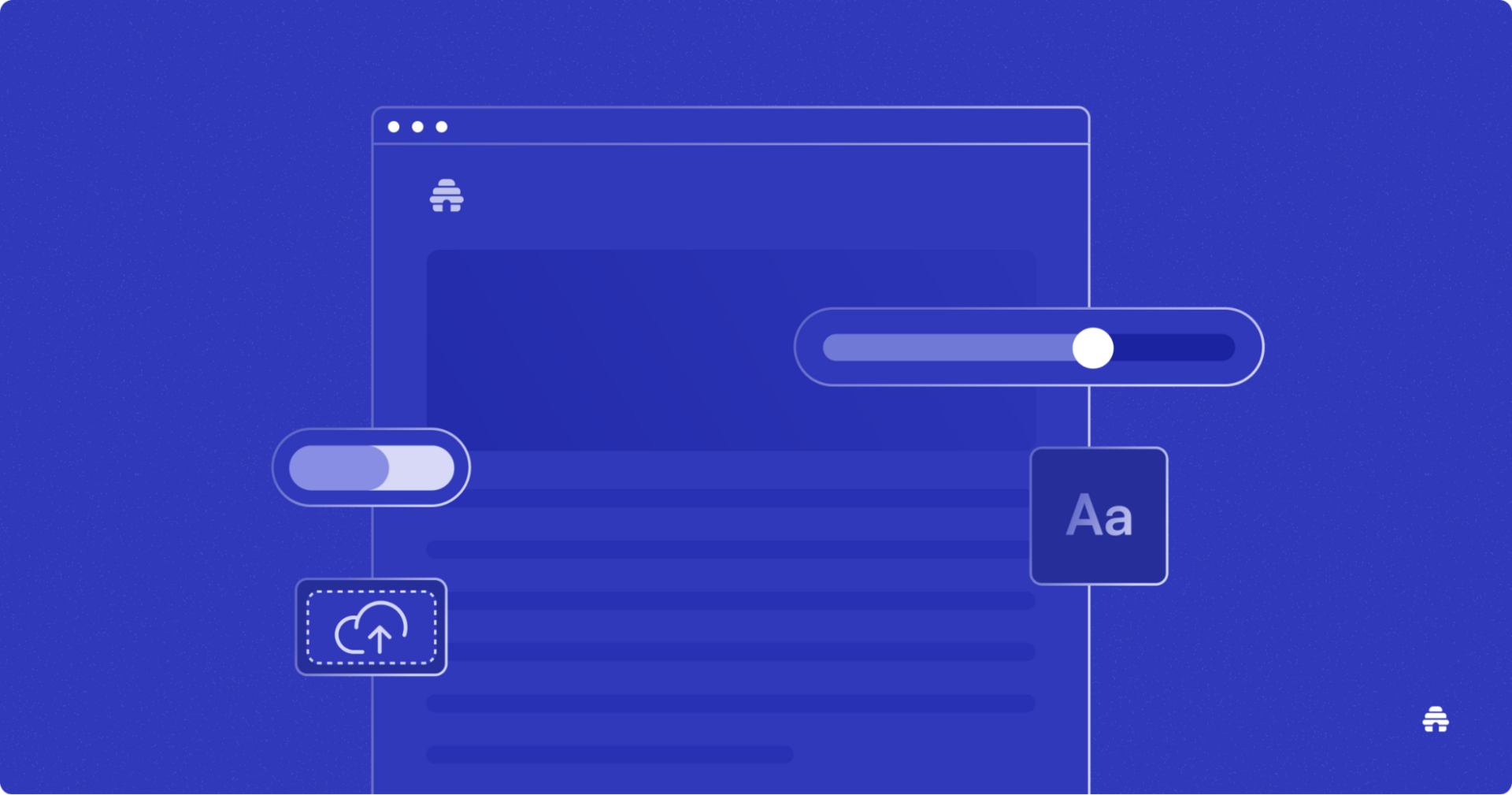
It's made for newsletters. Unlike generic website builders trying to do everything, beehiiv is laser-focused on one thing: growing your newsletter. Every feature is built with that in mind. The newest beehiiv feature is an AI-powered website builder that creates landing pages designed to capture your brand aesthetic and convert visitors.
It's free to start. Custom landing pages are included in the free plan. No credit card, no trial countdown.
The features you need:
Templates that already convert
Mobile-optimized automatically
Simple forms (just email, no friction)
Built-in analytics and A/B testing
Shows your subscriber count for social proof
Custom domain and branding
The creators featured here didn't have any special advantages. They just used the right tools and followed what works.
Final Thoughts
You've seen what works.
You know the patterns: clear headlines, simple forms, real proof, good visuals.
The playbook is right here.
The newsletters crushing it in 2025 aren't run by people with secret knowledge or massive budgets. They built a landing page that works and continually improved it.
Here's what I want you to do: pick one thing from this article and implement it this week. Maybe it's rewriting your headline with the benefit + time formula. Perhaps it's simplifying your form to just an email field. Maybe it's adding your subscriber count if you've been hiding it.
Test it. See what happens. Then tweak something else.
That's literally it. That's how every successful landing page in this article got built—one improvement at a time.
Ready to do this?
Visit beehiiv and create your landing page today. Pick a template, drop in your headline, and publish it. You can have something live in an hour.
Stop reading about landing pages and actually build one now.

Related Articles
The one place to build.